Columbia City High School
Visual Identity / Logo Design
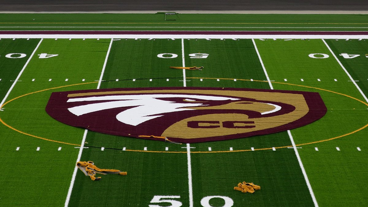
In 2018 I decided to do a conceptual rebrand for my alma mater, and as I started to post teasers on social media, it quickly escalated into something much more. Long story short, I knew Columbia City was building a new high school and thought it'd be a good time to update the logo, knowing permanent fixtures such as signage, the basketball court, football field, etc would be brand new. My social posts got hundreds of shares and shortly after the Principal and Athletic Director reached out to me inquiring about making the logo official.
We were on a tight deadline as construction had already started, but we came to an agreement and the rest is history.


Inspiration & Thought Process
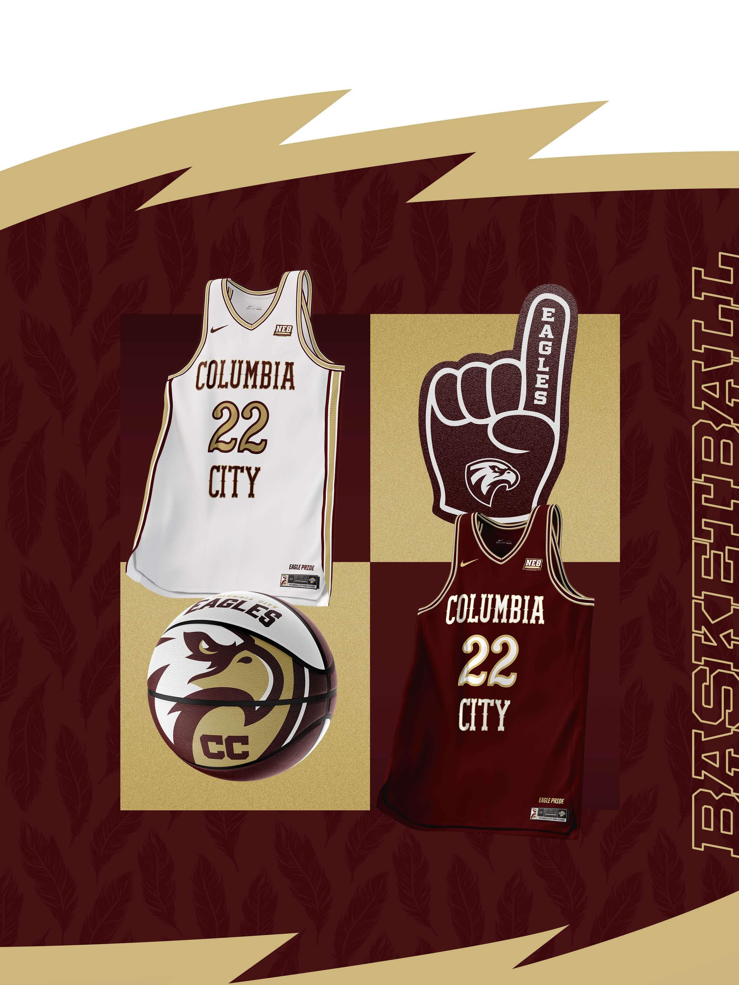
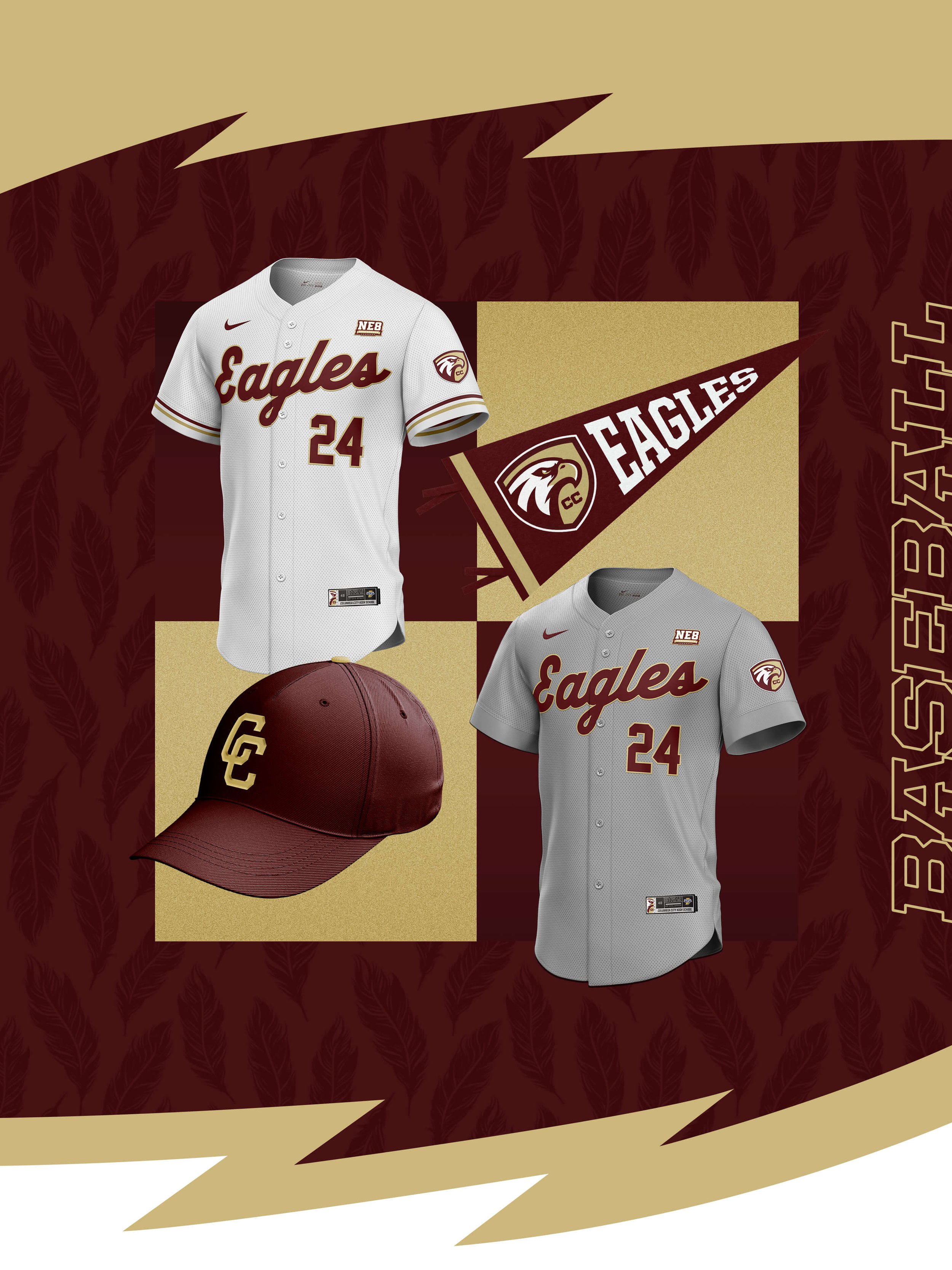
Like many high schools, Columbia City had gone through several iterations of their logo over the course of a few decades. Different versions were floating around and being used without any real continuity or consistency. The most recent version being used was a profile shot of an eagle with uneven line work and poor composition. In my re-worked logo, I wanted to maintain some of the general shape and idea, while making the overall mark feel a bit more professional and usable across various real world applications and colored backgrounds.
I decided to add a crest, as well as the monogram “CC”, to represent strength and reflect on Columbia City High School’s legacy.