Loras College
Visual Identity / Logo Design
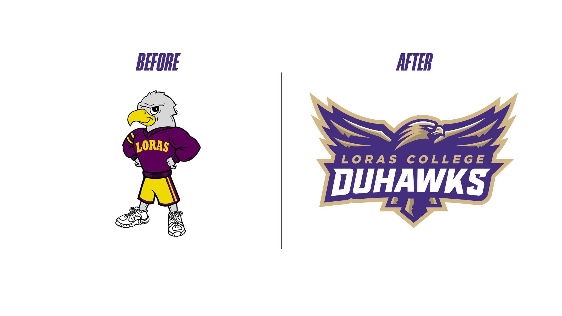
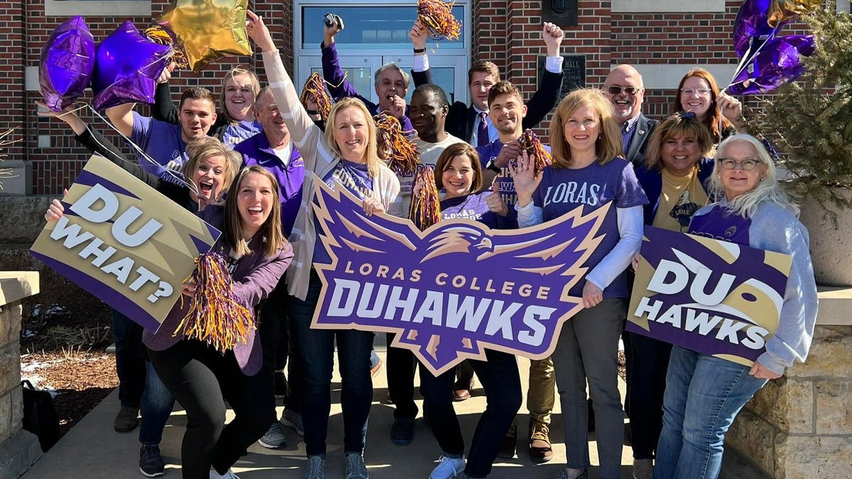
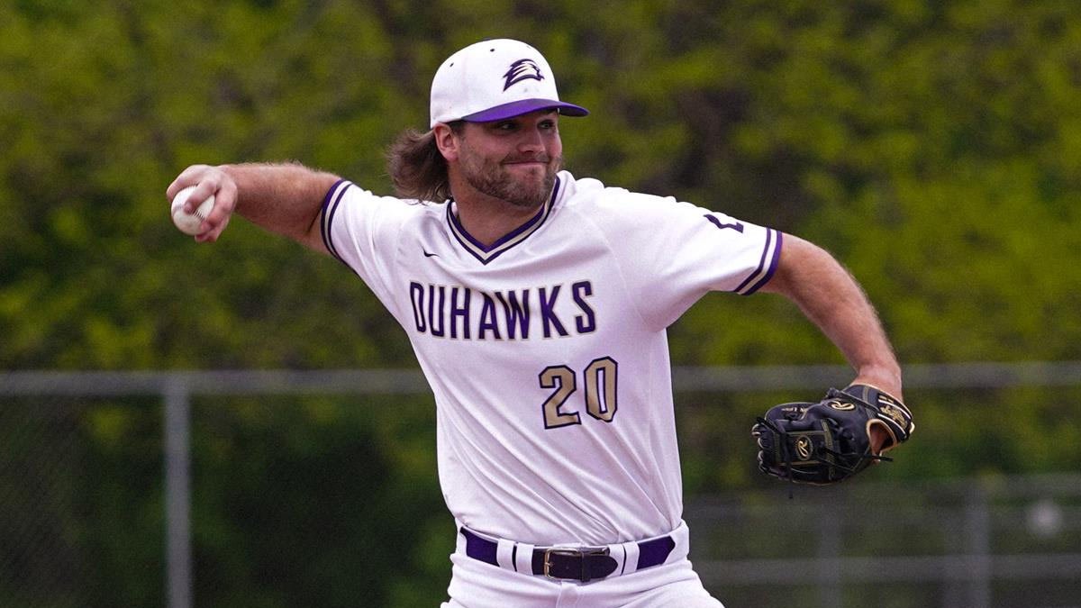
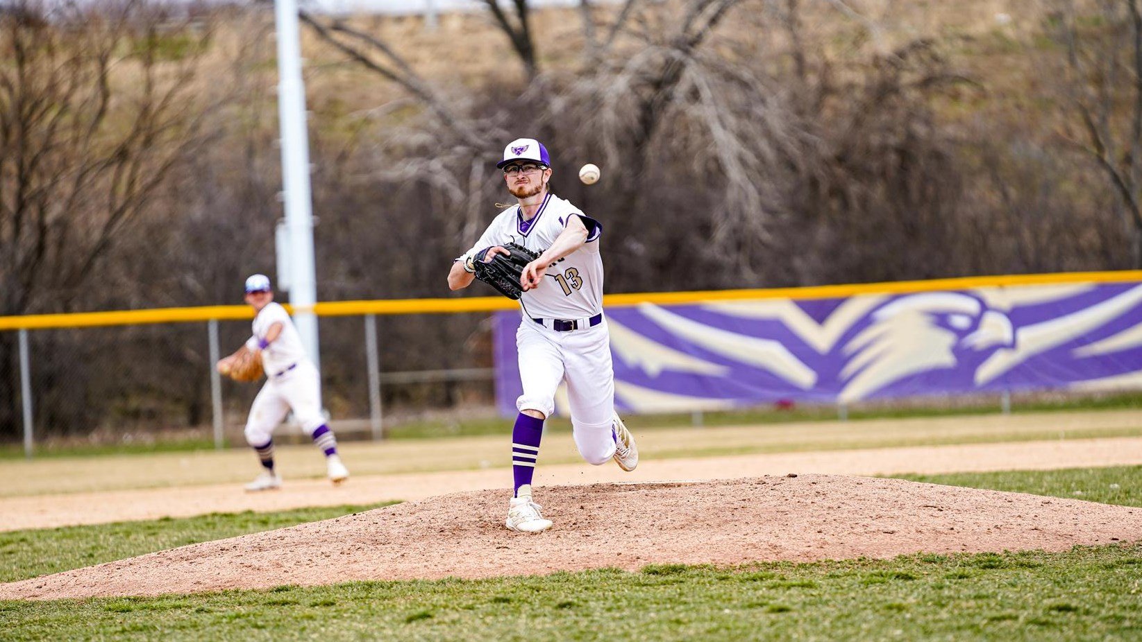
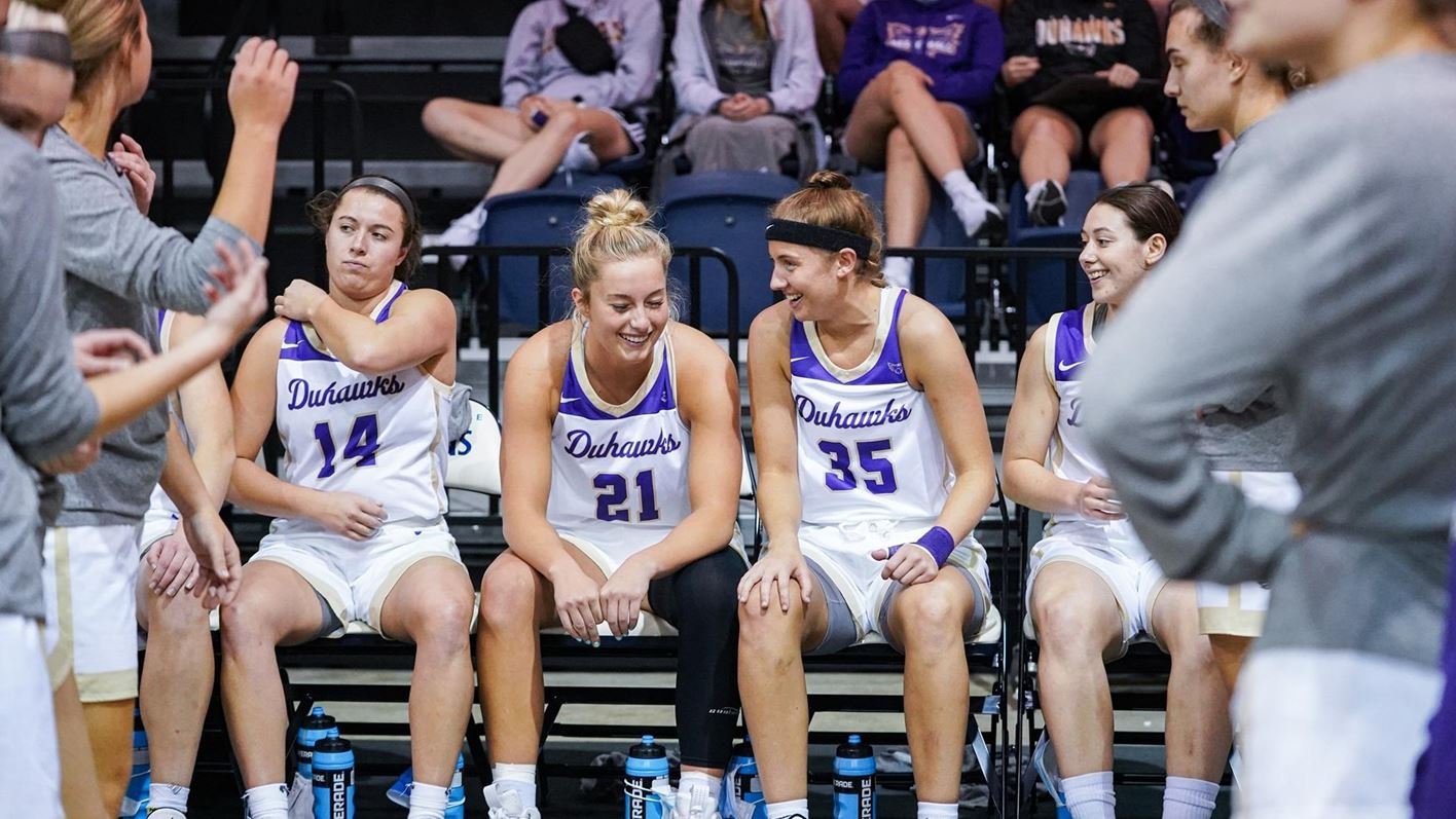
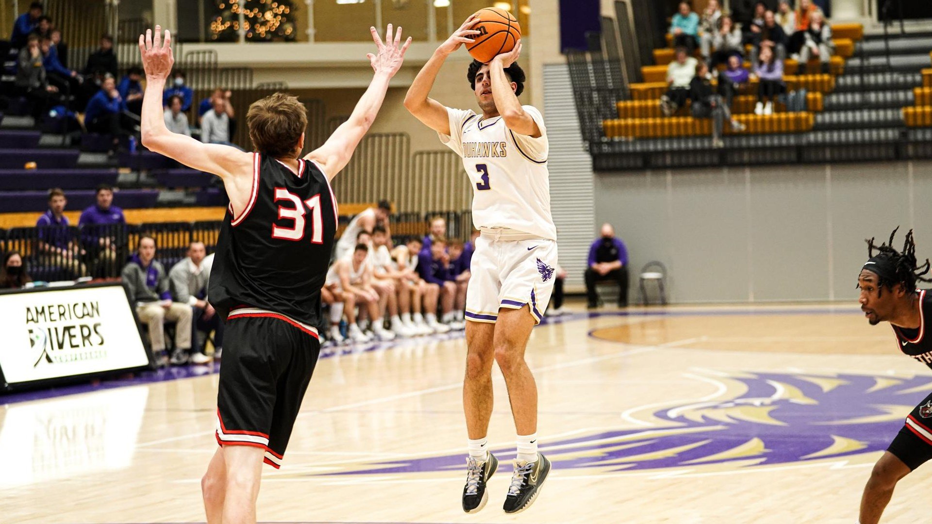
DUBUQUE, Iowa (Duhawks.com) – Loras College Interim Director of Communications & Marketing and Director of Athletic Communications Jimmy Naprstek announced on Friday, Oct. 12 the unveiling of the new visual identity for Loras College Athletics. The largest portion of the rebranding effort includes the official retiring of the “Dewey” logo in place of the new athletic spirit mark.
“This project began in its early stages over two years ago as an effort to reign in our department’s branding efforts,” Naprstek said. “There was a time where over 75 versions of the ‘Dewey’ logo were in use, so we knew first hand that we had issues with our identity. Today, our efforts are being rewarded as we announce and reveal our new brand standards that will represent Loras College Athletics for years to come.”
Wes Teska, a graphic designer based out of Fort Wayne, Ind., was the principal designer behind the artwork.
"It's been a privilege to rebrand such a prestigious college,” Teska shared. “I couldn't be happier with what we were able to accomplish, and I'm honored to be a part of the evolution of the Duhawks brand. I genuinely feel as if this is a logo that current athletes, as well as alumni, will be proud to represent."
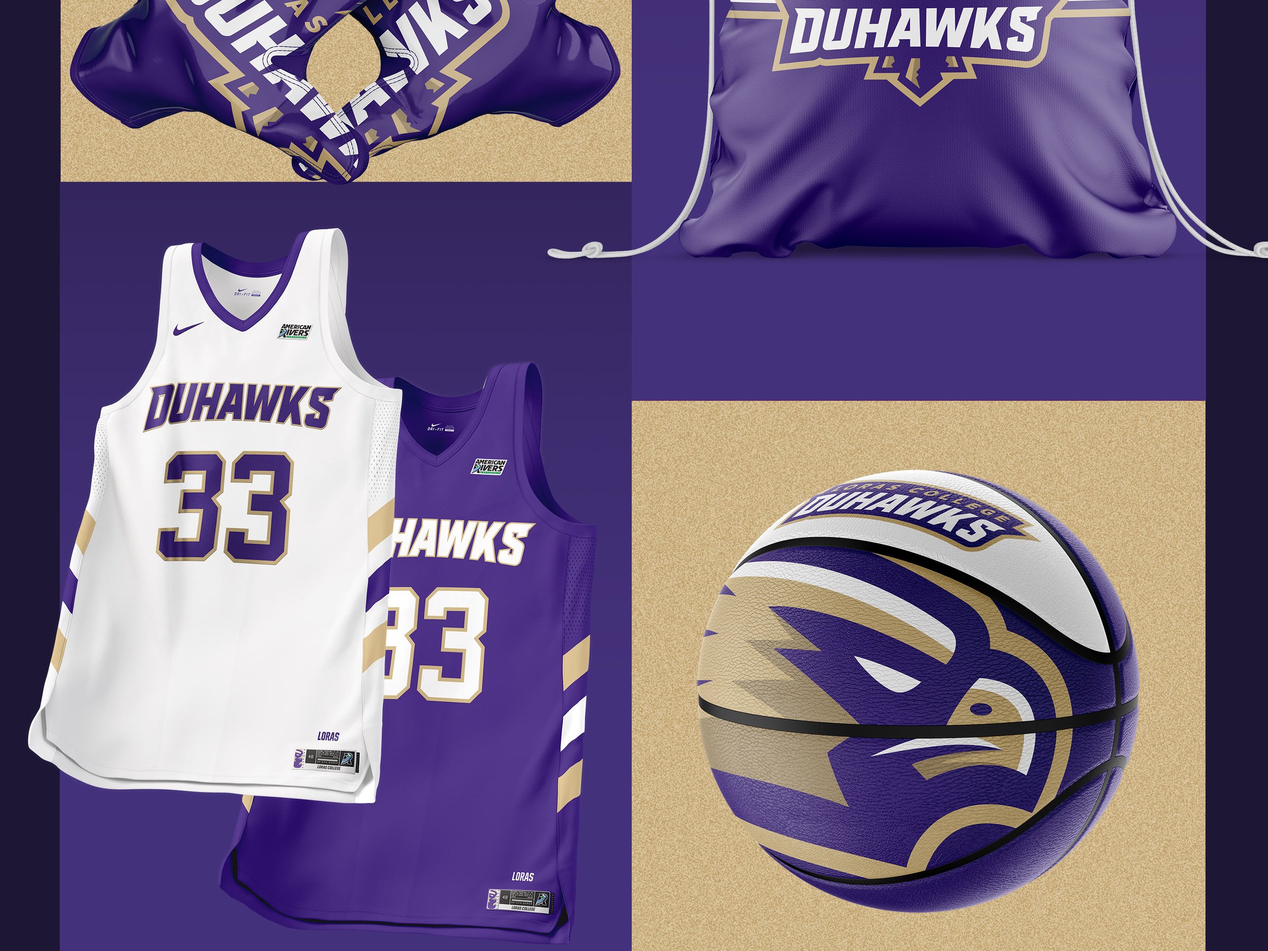
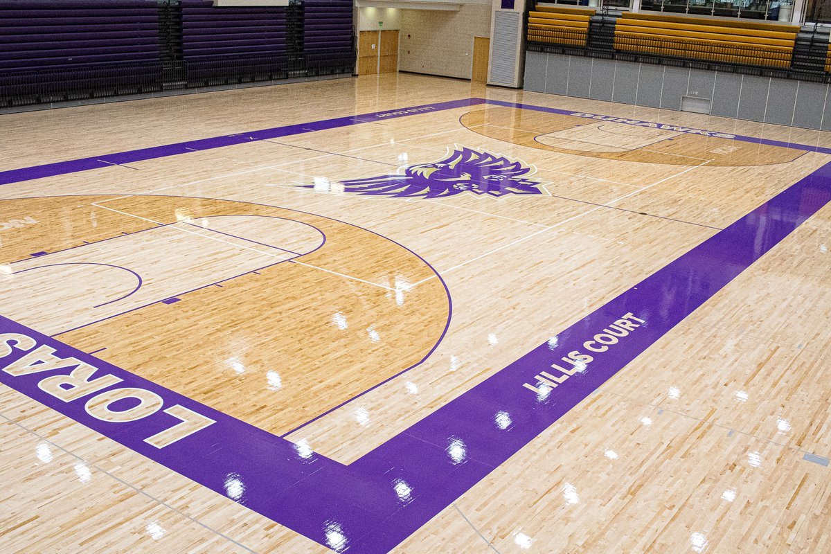
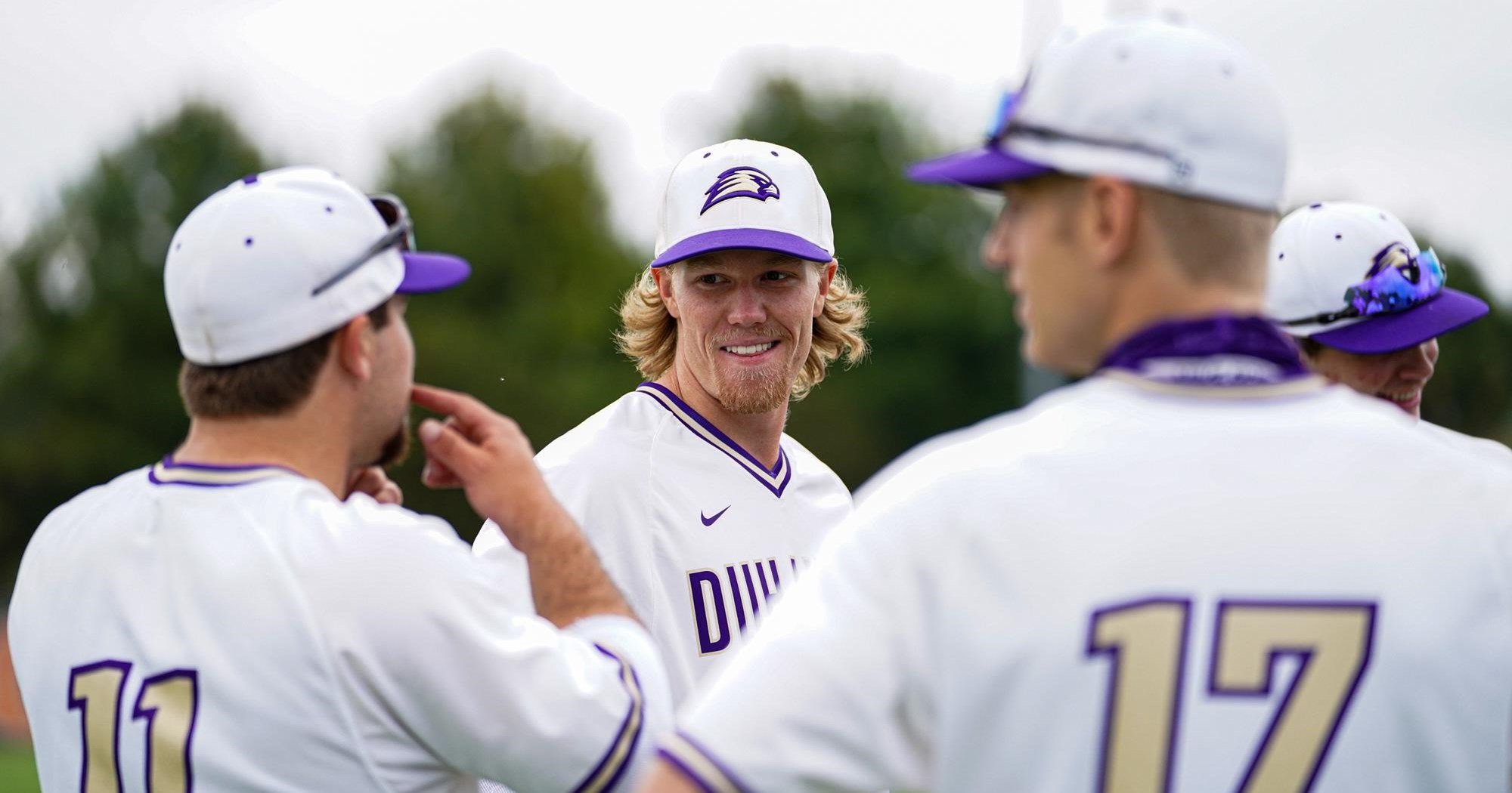
In addition to the visual identity upgrade, Loras also completed a refresh of its color palette and typography structure. The Gotham and Interstate font families have been adopted and implemented by Loras College as a whole along with a new swatch for the “Loras Purple”.
“Today marks the beginning of a new chapter in our storied history at Loras College,” Director of Athletics Denise Udelhofen said. “As someone who has seen multiple renderings and iterations of our Duhawk, I am excited to see this version become our public icon.”


Inspiration & Thought Process
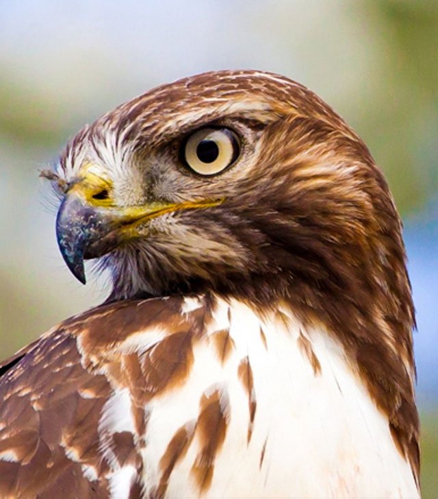
In discussing this project with the Loras College Athletic Department, they were very adamant on going a drastically different direction from the current logo. While the mascot “Dewey” had some legacy and equity with the student body and alumni, they were interested in pivoting to a more aggressive hawk, as opposed to playful mascot character. Initially we discussed a front facing head, however after sketching a few iterations, we pivoted to a more traditional profile perspective.
Ultimately, we needed something flexible that could not only be used as a full bodied hawk, or just the mascot head, but we also needed to be able to incorporate all of the different sports within the athletic department as well.